 Argentina. The company specialized in paints, Sui Color, recently presented its new color palette. The 20 shades chosen are inspired by three concepts that the company highlights within the current trends of the Argentine market.
1) Awareness: Tones such as blue "Open Sky", green "Equilibrista" and toasted "Te Dulce" stand out, pleasant shades related to nature that accompany the idea of relaxation and tranquility. To bring it to the home plan, this can be seen in simple, conservative environments and using colors to revitalize spaces. Light colors are recommended to be placed on floors, ceilings, furniture and supplementary objects of the environment that generate contrast, expanding the space and visually impacting.
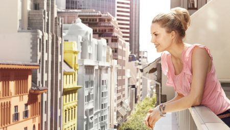
2) Tranquility: In this case, the shades such as Lacquer-Grey, The Open Sky, Current and Clear Water stand out, tonalities that refer to tranquility, inner peace and happiness, to the environments of the house that most relax and disconnect from the routine. They are ideal for use in a room to fall asleep or as a quiet way to start the day in the master bathroom.
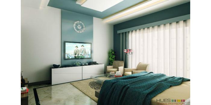
3) Take a Path: Color immediately creates the atmosphere of a room, taking advantage of the positive effects that colors bring moderately or generously throughout the home. Blues like Caresses and greens like organic relax and reassure while good life oranges, yellows and reds are cheerful and positive colors. An attractive color enhances life by lifting the spirits or energizing a space. A deep blue Winter Sky brings an extra touch of serenity to a quiet workplace. Touches of white and orange moldings and wooden elements bring warmth and balance to the room. And the bright yellow provides an atmosphere of free fun.
These colors are also ideal for stair breaks, lobbies, and entrances. Use them to highlight a window with a graphic color block or to display a door.