We spoke to the team at Signify, a world leader in lighting, to help us spot the key aspects of colour selection.
By Claudio Fazzone*
 Lighting is undoubtedly the most important variable when defining color combinations for a space. The different ways in which we perceive a color are diverse; They depend on several factors that make the person and the space. Of these factors, lighting is key.
We know that the choice of color is not an easy task. The color palette that we select will be essential to achieve the final finish of the environments that we are going to decorate.
There are many aspects that we must take into account, beyond the aesthetic identity of the space; Light colors give us a greater sense of space, greater luminosity, if we apply combinations of light and dark colors we can give a feeling of expansion or contraction according to how they are used.
Also the different finishes; Whether matte, satin, glossy, they significantly influence the perception of color.
A brighter surface tends to reflect more light, resulting in a clearer perception of color in contrast to matte finishes. Therefore, it is important to take into account the characteristics of the physical space, the selected finish and the lighting.
Frequently in Venmark we are presented with needs of our customers to avoid, or reduce, the number of claims for the difference in color between the selected and the applied. The data we collected tell us that most of these complaints were not problems of painting, or color preparation, but because of the different types of lighting existing in stores and homes.
Our architecture area takes this experience as a basis for the development of the color zone of the stores we design. In it, the main premises, as far as possible, are to have a source of natural light, variants of lamps that allow us to assimilate the real situation and locate them to generate ambient and focused light avoiding shadows.
For this reason we understand that when we select colors we must think about color plus lighting: if we dissociate these concepts we run the risk of not achieving the final finish that we aspired for our environments.
To elaborate on these concepts, Venmark met with the Signify team that counts Philips among its portfolio of brands. On behalf of Signify participated Cecilia Rozada, Head of Press for Argentina; Carolina Antico, Communications Manager for the Southern Cone; and Luis Regner, Product Manager.
Knowing about Lighting
Claudio Fazzone: Many of us have grown up enlightening ourselves with Philips; we have a strong bond with the brand, could you tell us about Signify?
Signify: Signify is the leader in conventional lighting, LED and connected lighting. Philips is one of Signify's core brands for lamps and luminaires and other lighting products; for both professionals and consumers.
Claudio Fazzone: An experience that we have with some frequency in the paint market, and unfortunately it is not the best, is the claim of colors. Many clients select colors from a sample book and, when they apply it in their environments, they perceive that the color is not the selected one. When attending these claims it is verified in most cases that the difference was not in the painting but in the lighting ...
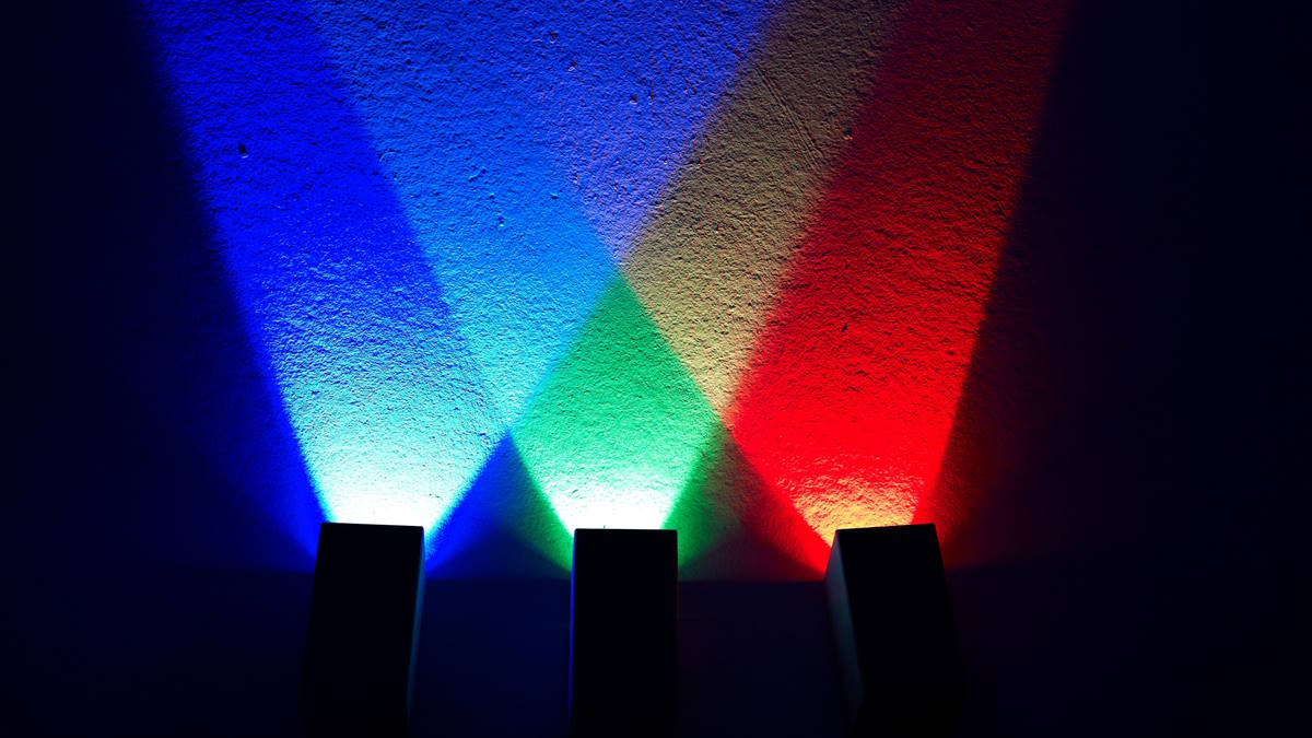
Signify: Lighting is key to being able to perceive colors directly. Let's take the natural lighting, the Sun, which perfectly reproduces the colors; in this case your CRI is 100, the maximum scale.
Claudio Fazzone: IRC?
Signify: It is the Color Reproduction Index, where natural lighting is 100. The old incandescent bulbs also reached that same IRC. Currently a home led lighting has an 80 IRC and professionals reach 90.
To keep in mind, we mentioned that some of the old technologies, which may still be in use, have much lower CRIs. Fluorescent tubes have a 60 and sodium lamps, usually used in public lighting, a 30 IRC. In the latter case, the color is practically not perceived.
It is important to note that all our packs have the IRC information of the lamp.
Claudio Fazzone: The difference between warm or cold light affects color perception.
Signify: The human eye perceives greater luminosity in cold light, but there is no difference in CRI between warm and cold light.
What can influence the perception of color is the issue of shadows.
Claudio Fazzone: Part of our job, when designing stores, is to ensure that the color sector has the right lighting to avoid claims. What should we take into account for this?
Signify: In this case, the main thing is to have a lot of intensity to attract attention and give more brightness to the colors. Focused lighting, having lamps greater than 80 IRC, avoiding shadows, and being able to count on warm / cold light alternatives is a plus that, although it does not affect the IRC of color, can improve the experience in the choice.
Claudio Fazzone: In some cases we have recommended to our customers that, in addition to having samples with adequate lighting, they offer lighting products, lamps. We understand that it would be important to reinforce the concept that color is formed by painting plus lighting.
Signify: We are beginning to grow in specialized paint stores, we see that there are opportunities in this channel that is expanding its product lines and adding lighting. Some of them, in addition to lamps, have added artifacts from our line, focused more on functional lines than design.
Claudio Fazzone: Finally, could you mention which trends in lighting are being the most representative?
Signify: Led technology is fully functional, allows us to control lighting as well as modify colors. It is increasingly used in architectural applications to highlight buildings, monuments... and also at the household level; Modify the colors, regulate the intensity of the lighting according to the intensity of natural light, schedules ...
For this, at Signify we have specific development units; both for the professional and home environment.
Claudio Fazzone: Thank you Signify Team! It really was a pleasure.
*Director of Venmark
[email protected]