
Colombia. "The possibilities offered by the walls allow you to modify the aesthetics of the environments just by painting them, so this year giving color to just one of them is one of the things that is recommended to do," says Pintuco, a brand of AkzoNobel.
"What do you notice first when you walk into a family member's or friend's house? Without a doubt, it's in the decoration they have, whether it's in the paintings, the textures or simply in the color. This is how the walls become the main scene within the home, and painting one of them achieves a huge transformation, with just a small investment," said Jesús Márquez, Pintuco's Color Manager.
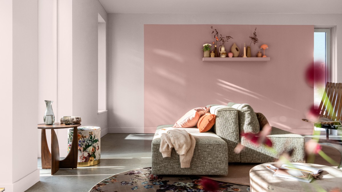
And for the walls to speak at the beginning of the year, according to the Colombian company, a quick and economical solution is paint, so the company brings "Floral Texture", the color of the year, which gives a sense of stability, calm and friendliness to inspire the transformation of the different environments of the home.
"Floral Texture, is a delicate color that changes tone with light, but that will always bring warmth to one of the walls on which you want to apply it; for example, it goes very well in an environment such as the kitchen, achieving a sophisticated feel," said Márquez.
According to the executive, being an independent and subtle tone, it also provides a solid base to combine with a wide variety of other shades. That is why three colour palettes have been created around it, to bring a different personality to each of the spaces in the home.
Welcome palette. Composed of warm tones of natural stone, earth and clay. This family of earthy colors makes a room feel familiar and comfortable. They are perfect colors to layer them and create a pleasant and well-kept atmosphere.
"This is a palette that can be used in spaces of the home where you want to generate a warm atmosphere, for example, in the dining room or in a living room. It's ideal for places where people gather to socialize with family and friends," Marquez said.
Palette of inner peace. Inspired by the hues of forests and seascapes, fluid blues and greens bring a sense of calm and clarity. In addition, they combine perfectly with natural materials such as wood, cork or wool: simple and discreet treasures of nature that contribute to the beauty and authenticity of the home.
"This palette is perfect for breakout spaces like the bedroom. In this place it is recommended to paint a wall with Glacier Stream, on the other hand in the studio where more concentration is needed, the color that suits it best is Betula Green, or some homes have an auxiliary room where the television is and the family gathers at night, so the ideal color is Nordic Gray", said the manager of Color de Pintuco.
Positive Energy Palette. Developed to harness the power of fun, it offers a modern combination of soft lilacs and yellows, perfect for creating fun combinations that add impact to any environment without being daring or intrusive. These colours combine perfectly with natural materials such as ceramics and ecru weave fabrics that enhance any decorative element such as small sculptures and cushions with soft-touch textures.
This palette is ideal for spaces where you want to start the day with all the energy: for a dining room where you have breakfast, the reference color Warm Morning, or in a room to make it more illuminated, Chinese porcelain is ideal.
"Depending on feelings or tastes, you can choose a preferred palette, but it is also valid to choose colors of different trends within the same house, thus providing dynamism when painting, you only need imagination, the rest is done by color!", says the organization with an experience of more than 75 years in the market.
For more inspiration, the blog on the Pintuco website offers different content with the best ideas in terms of color and decoration. In the Pintuco App, which is completely free both in the app store and on Google play, people have the possibility to take a photo of the environment they want to paint, and digitally they can test the colors to see how they look in the space.
Pintuco's 2024 color trends are available in the market and can be found in any of the brand's more than 190 stores nationwide.


Leave your comment